Most Star Wars fans have fallen in love with Baby Yoda, but the process to come up with the perfect look wasn’t easy. Instead of a cute little green guy, we could have gotten something radically different and unappealing.
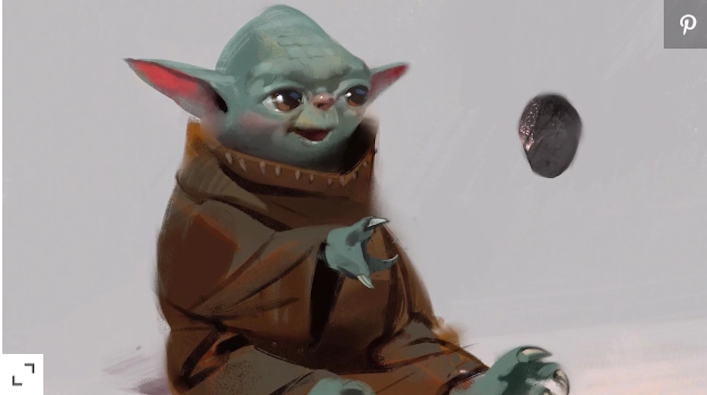
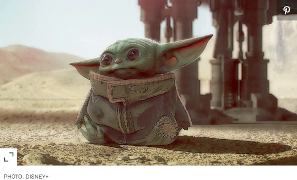
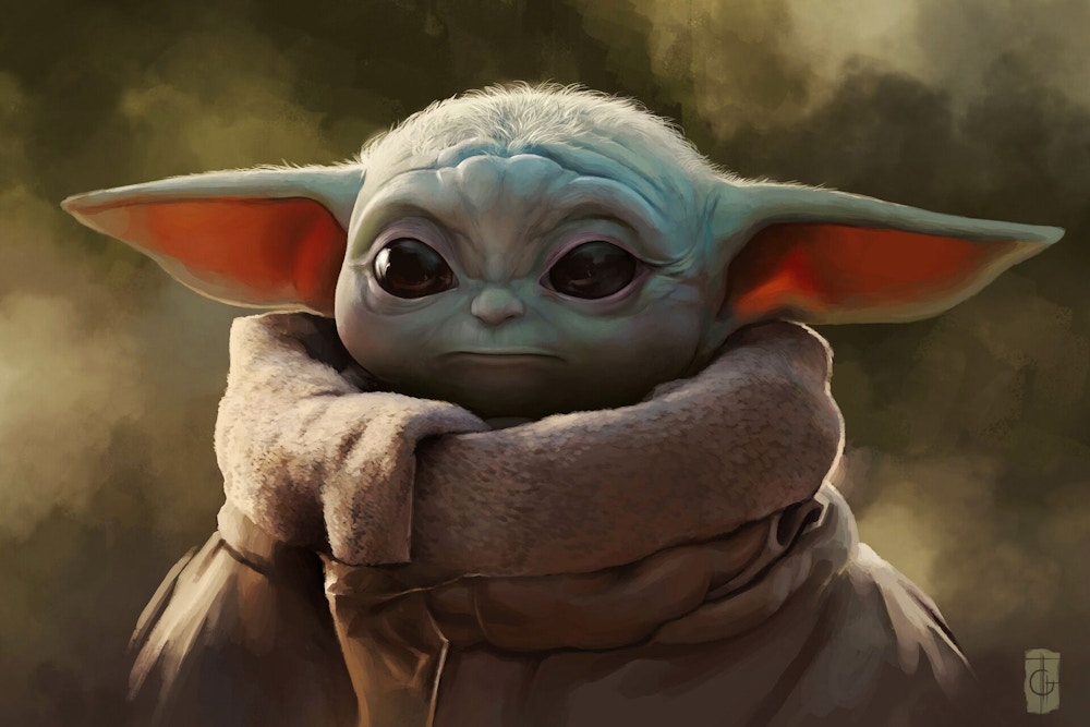
During the recent episode of “Disney Gallery: The Mandalorian”, which is available on Disney+, several early concept drawings for Baby Yoda were revealed and they definitely are fascinating to look at. You decide for yourself if these early designs were better or worse.
Here are a few of the different early concept designs for the lovable Baby Yoda:
This little guy looks like he went a little nuts at the all you can eat buffet table. Not a horrible design, but nowhere near as cute as the final version.

These two guys seem to resemble bats to me. Bram Stoker would have been inspired by these two little vampires in training and what music they must make.

Now this design looks a lot like Yoda himself. Maybe a little too much.

Here is the design that won over Jon Favreau and his crew. Definitely the cutest of the bunch and the one that was the basis for the final version that we all came to know and love.

Well, there you have it. What could have been and how these early designs influenced the look of Baby Yoda. The good, the bad and the ugly from a galaxy far, far away….

Source: EW

