Disney released a new Hollywood Studios logo today during the Disney’s Hollywood Studios 30th Anniversary Celebration. The new logo has BB-8, Mickey and Woody inside the “Hollywood”, representing the past, present, and future of Hollywood Studios.
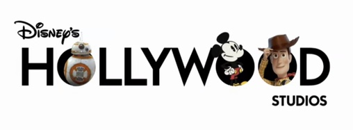
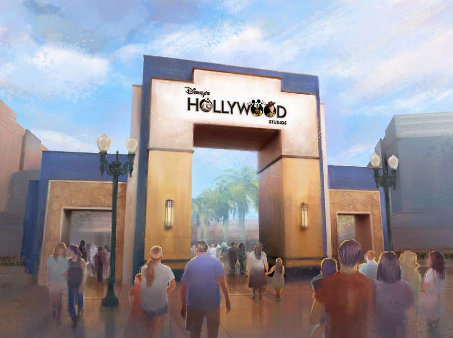
The logo will be placed on the Animation Courtyard arch soon.
How do you feel about the logo? Sound off in the comments!
Stay tuned to WDWNT for all your Disney’s Hollywood Studios 30th Anniversary coverage!


Really? This is the best they could come up with? Can we get any more literal?
I feel like this “new” logo lacks creativity and is a dumbed down version of Disney simply selling the three major selling points of their park when it’s complete.
DUH, its not in Hollywood, but considering all the other suggestions, this one stands out. However the text is to plain.
Looks great! Love the updated logo! Very cool idea to make use of the O’s like that, for the characters to hang out in. Provides opportunities to change around who’s in the O’s as well, for more merchandise/posters.
That is SO incredibly boring. If you match it up to the other parks logos it just is sad.
So this is confirms that the park’s name will not be changing?
Very mixed feelings tbh. I quite like the clean modern look, not crazy about the character choice.
Well, it’s…. definitely the word HOLLYWOOD written in Futura Bold. And some characters stuck in there.
Not the most creative or imaginative logo, or a “logo” at all, really.
Pretty typical of today’s Disney all around — lacking any creativity and totally bland, used as an opportunity to sell its own characters. Thumbs way, way down.
I don’t really see how this represents the past….but I guess there isn’t really any of the original MGM studios left to represent!
Was really excited to see the logo, and was extremely disappointed when it was so plain.
Yuck! It is boring. Bring back the art deco style!
It looks bland compared to the current logo.
You are showing two different logos (the Mickeys are different”. Which one is it?
We didn’t make the logos, that’s what Disney provided, so I guess both?
Don’t like it! Way to go Iger your ending up like Eisner.
This isn’t scalable at all. There was definitely a higher up demanding more characters, because no designer would think this was a good idea. It feels like something a foreign licensing company would create for a dollar store coloring book.
hate it
Don’t like it! Boring.
Boring. No like.
A pretty good evolution. I do like how each “O” highlights a different style of animation. traditional 2D animation, 3D animation, and CGI with live action.
Speaking as a designer, this is absolutely terrible. The kerning is awful, Mickey (the most recognizable character) blends into the black of the “O” and “W”, reproducing this at various sizes is going to be an absolute nightmare, etc, etc. I could go on for days. There was a lot going on in the old logo and it was far from perfect, but it had energy and the type had character (that W!). Not sure who did this or okayed it but this is such a misstep.
If it’s supposed to be “past, present, future” at least put them in the right order.