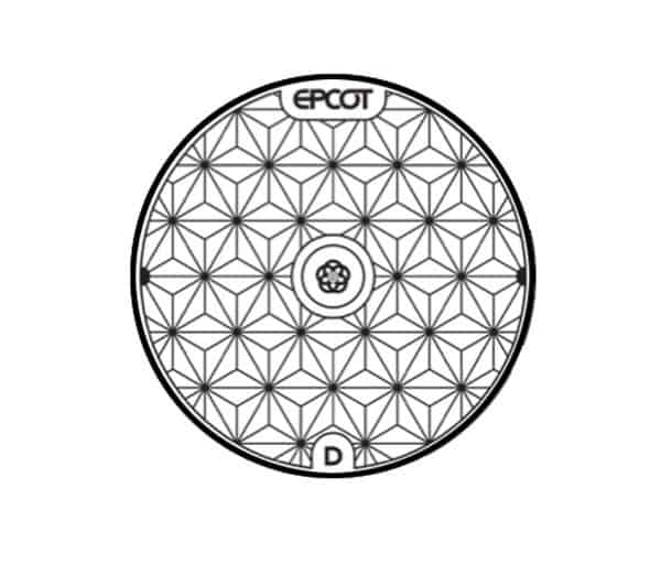
In case you missed it over the weekend, we released new concept art for some Spaceship Earth manhole covers that will grace the re-imagined entrance area of Epcot when it is completed, also confirming the return to a classic style logo for the park:
Today, we’ll take a look at some more previously unreleased art showcasing what this new entrance plaza will look like. First, here’s the concept art already released by Disney:

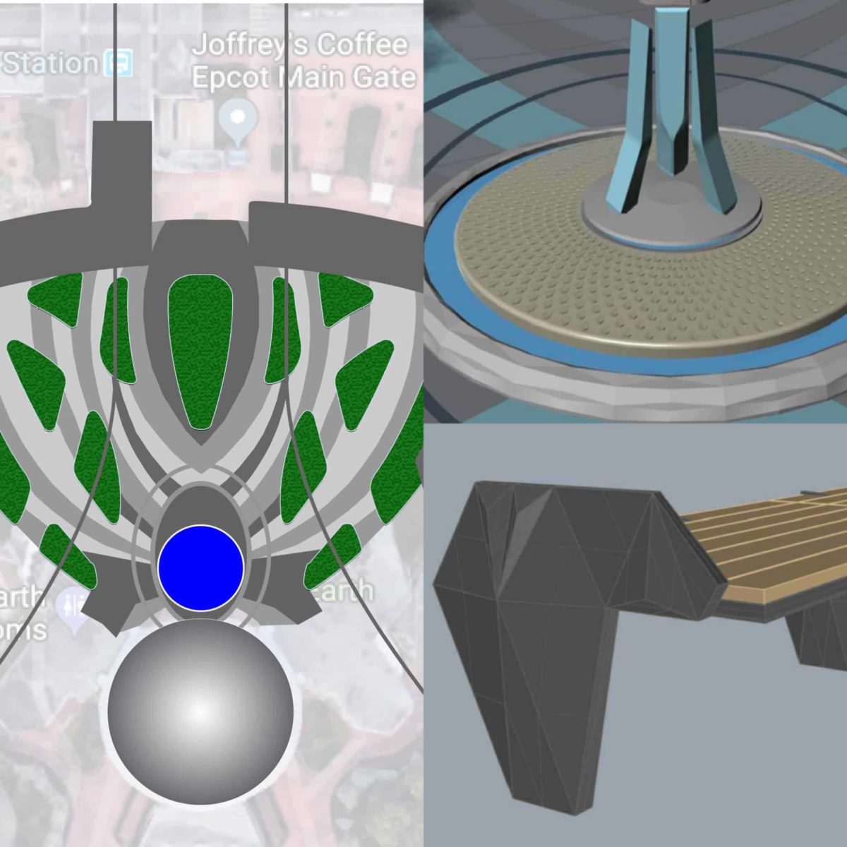
To give you a better idea of what you’ll be walking through when the project is done, here’s a new rendering providing a view from above:
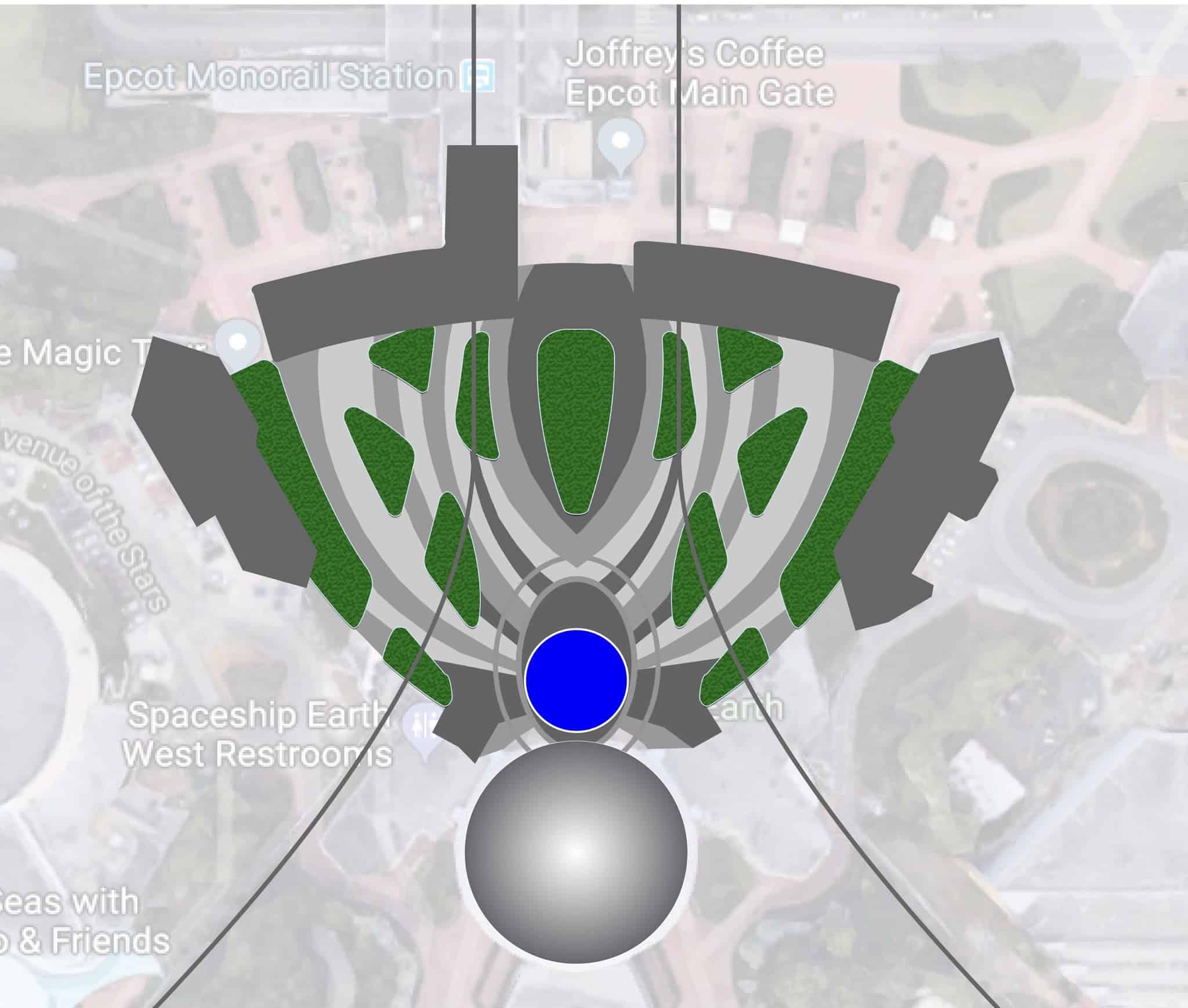
The new rendering should give you a better idea of the pavement design and layout of planters and such for the new entrance area. Leave a Legacy monoliths are currently being removed to make way for this project.
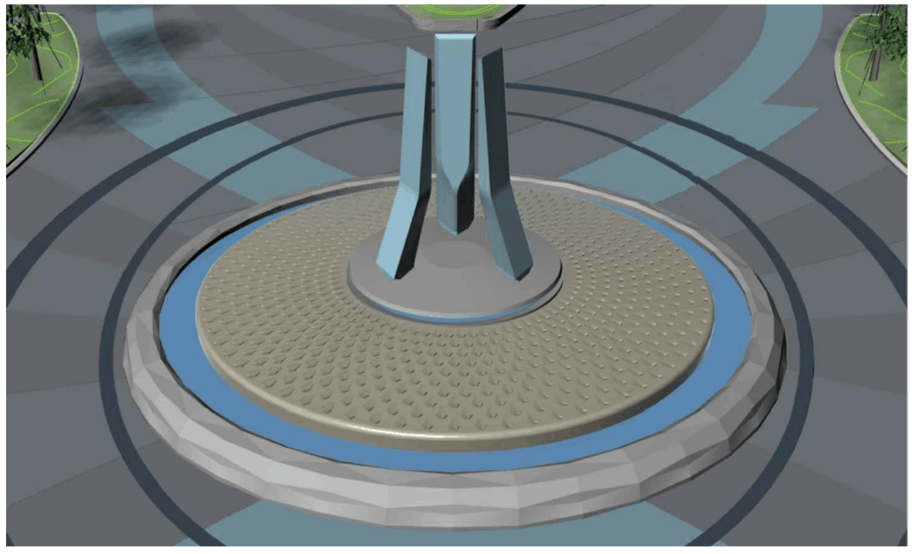
A much-anticipated part of the project is the fountain that looks very much like the original one from EPCOT Center. Here you can see a new computer rendering of the fountain, which honestly looks pretty true to the the classic in many ways:
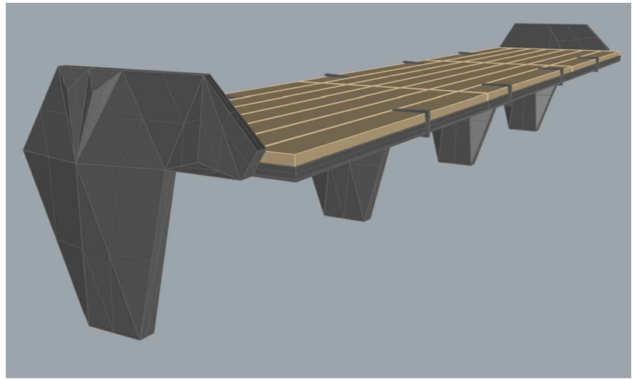
Last, but not least, guests will find new benches throughout the area. The benches are wood with stylish accents for the supports.
All of this work is part of Project Gamma, which includes an re-imagining of the park’s entrance, the center area of Future World, and eventually, Spaceship Earth. We of course revealed all of these plans already and you can read all about the yet-to-be-announced details of Project Gamma here, such as the new Beer Garden, Permanent Festival Center, and more.
Be sure to stay tuned to WDWNT.com for further information on the transformation of Epcot.


just here to read all of the “Clickbait Corless” responses that will eventually end up on The Wonderful World of Psychotic Comments.
Are these real? I’d assume Disney would be using better programs than they do. Maybe this is why it takes so long for them to design and deliver things!
This is all rough stuff used for the construction process
Why have any planters? Easy to trip over the edges and the main planter is place right in the middle of the best photo opportunity. The fountain should be on the side.
Why in the world would they even waste time with a fountain off to the side? It looks perfect where it is going.
It’s called aesthetics.