It’s the end of an era for Hollywood… or at least Disney’s Hollywood Studios. After receiving some new dark blue and cream paint, the Animation Courtyard arch had its former logo sign removed. Now, it appears that the park’s new logo sign has been installed on the arch, signaling a final step in the park’s 30th anniversary transformation. With the opening of Star Wars: Galaxy’s Edge and the impending arrival (hopefully) of Mickey and Minnie’s Runaway Railway, the park wants to focus on and maximize these new properties, first and foremost by way of its new logo.
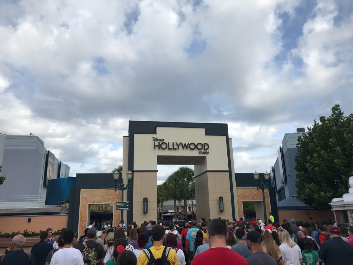

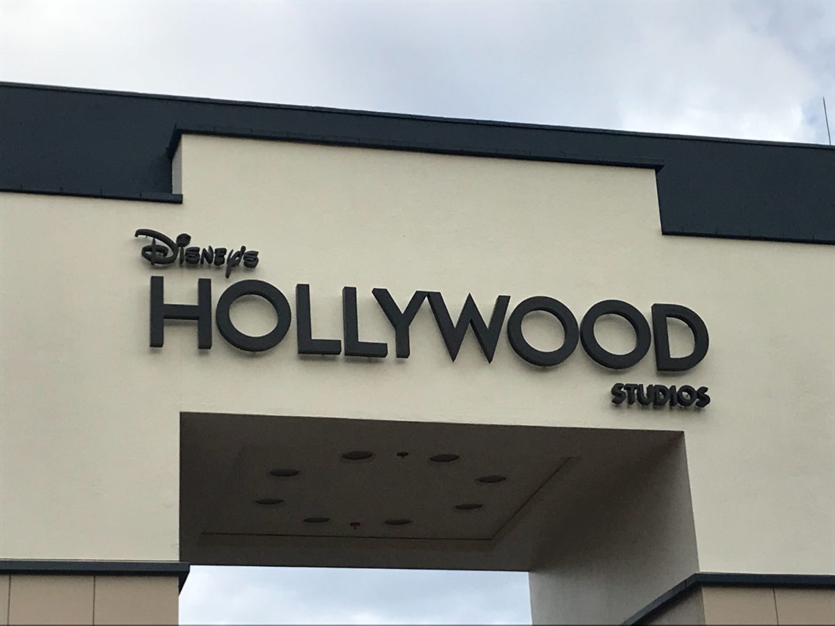
The new logo signage features a somewhat plain design, albeit void of any character accents, like BB-8, Woody, or Mickey Mouse from the new animated shorts and Mickey and Minnie’s Runaway Railway. Concept art for the new archway was revealed alongside the park’s new logo as part of the 30th anniversary celebration earlier this year in May. It’s still unknown whether the characters will be added to the sign at a later point.
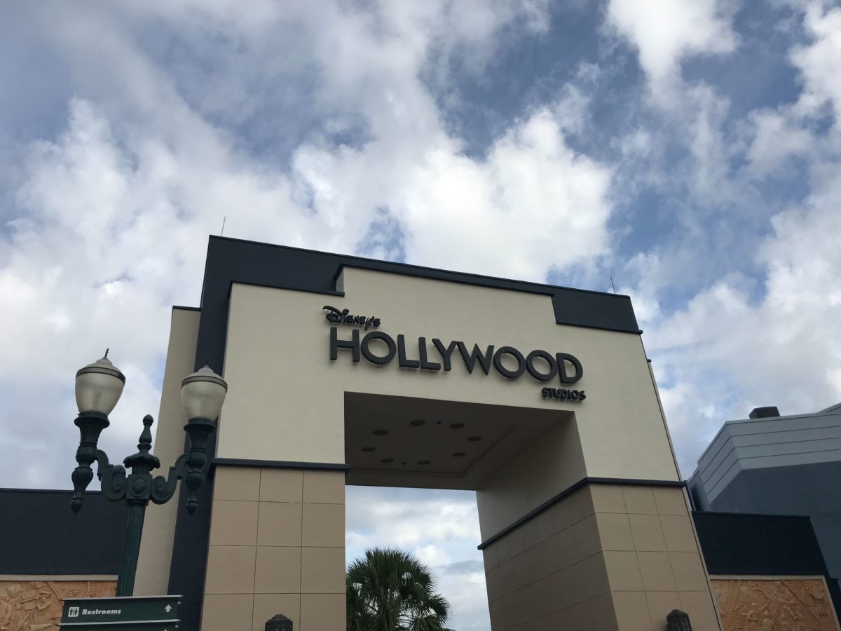
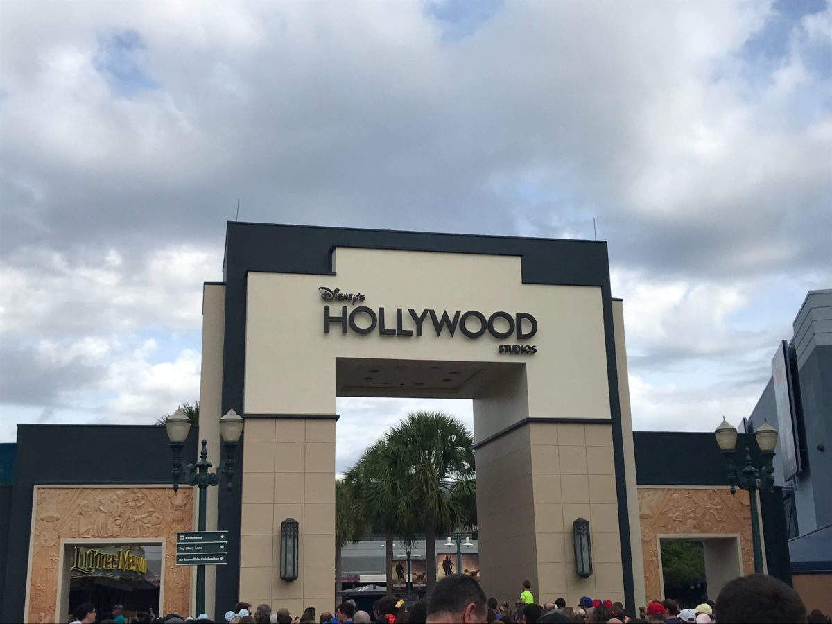
The smaller arches flanking the sides received the same dark blue color as main central arch as part of its remodeling. The sculpted inner frames of the arches, which feature scenes from the Golden Age of Hollywood, remain thankfully untouched.


The former sign had been up since the park underwent the change to Disney’s Hollywood Studios in 2008 and was only preceded by the Disney-MGM Studios sign from 1989 though 2008.
What do you think of the new signage? We still recall the audible groans let out by the audience during the logo’s initial unveiling back in May, and we’re not sure our opinions on it have changed since.





I hope the character accents are still coming at some point. What a letdown if the sign stays like it is in its current form.
I miss the former, this one is bland.
I might be in the minority here, but I like that a lot
or I at least like it more than I expected.
I actually really like the simplicity of it.
Bland and boring. Hope they’ve got some additions planned for a future date because, right now, it’s not the slightest bit interesting or photo-worthy.
i thought i would like it without the characters but it is just too sterile. at least they are truthful with the logo. “studios” only really applies to Indiana Jones anymore.
It looks so good without the characters! The new coloring and signage looks sleek.
It’s nice. Simple, clean. Signifies that park is a blank canvas for your Hollywood adventures.
I can just imagine Sour Bill reading the sign – “Welcome to Disney’s Hollywood Studios”.
More oddly – what’s the point of this thing now? I’m a latecomer to Hollywood Studios myself and it just now occurred to me that that serves as a sort of symbolic entrance to the Studios portion of the park which no longer exists.
I think it is a little “ sterile “ but this lends to its clarity & readability!:) I do like the focus on Hollywood instead of Studios, like in the previous signage:) it’s clean & crisp & the park will still fill our ‘ bank’ with great memories!!!
I suspect the people who like this sign are the same ones who like the new Tomorrowland sign. It’s boring, plain, and uninspiring.
I’m actually okay with the Tomorrowland sign, but this one just needs…something.
That type face looks like one called “Twentieth Century” that was created by the Monotype Cooperation in 1937. It was “art deco” influenced and used all over the place as a kind of “default font” for books, magazines, ect… until “Helvetica” came along in the 1960’s (The font on WDWNT looks like Helvetica) but “Twentieth Century” is a pretty generic font by design, it was made to be simple to print and read, and it looks to me like Disney got these letters out of a sign maker catalog or something. The old front was a much more unique looking, 1930’s “art deco” style
I’m a big fan of the old black and gold logo, can’t say the new one floats my boat at all …. but goes to show how bland Disney has become the magic is slipping away in the salami method small chunks at a time