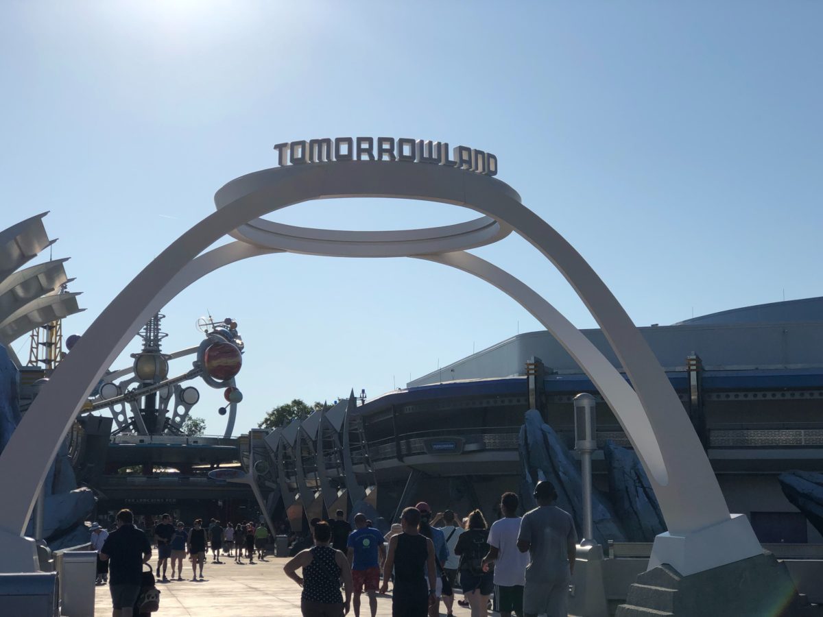
There’s a great big beautiful Tomorrowland sign, shining at the entrance to the land! The newly redesigned Tomorrowland marquee has been installed at the Magic Kingdom!
The colorful, iconic sign that welcomed guests since 1994 was removed from the park back in July. Right after the removal of the old sign, we were given an idea of what the new marquee could look like from some updated map images. It seems like they were pretty accurate.
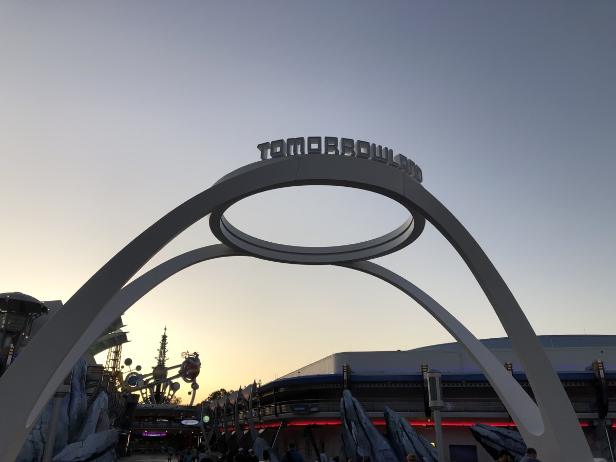
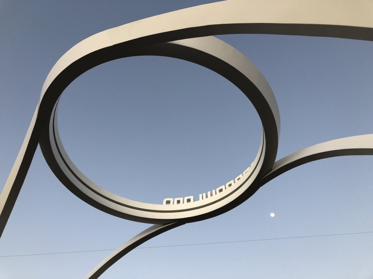
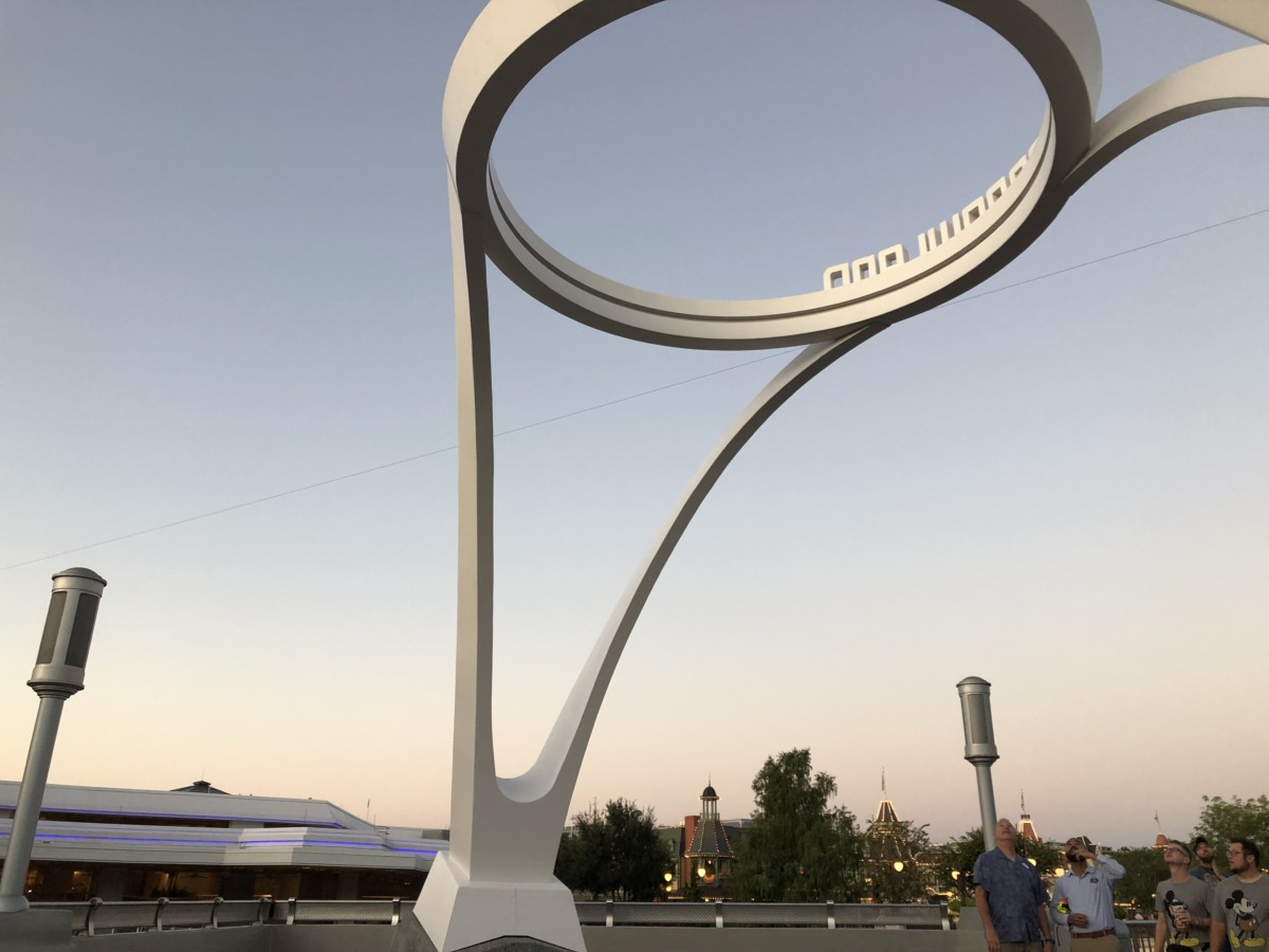
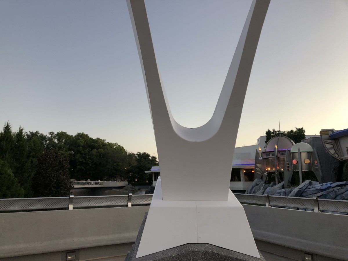
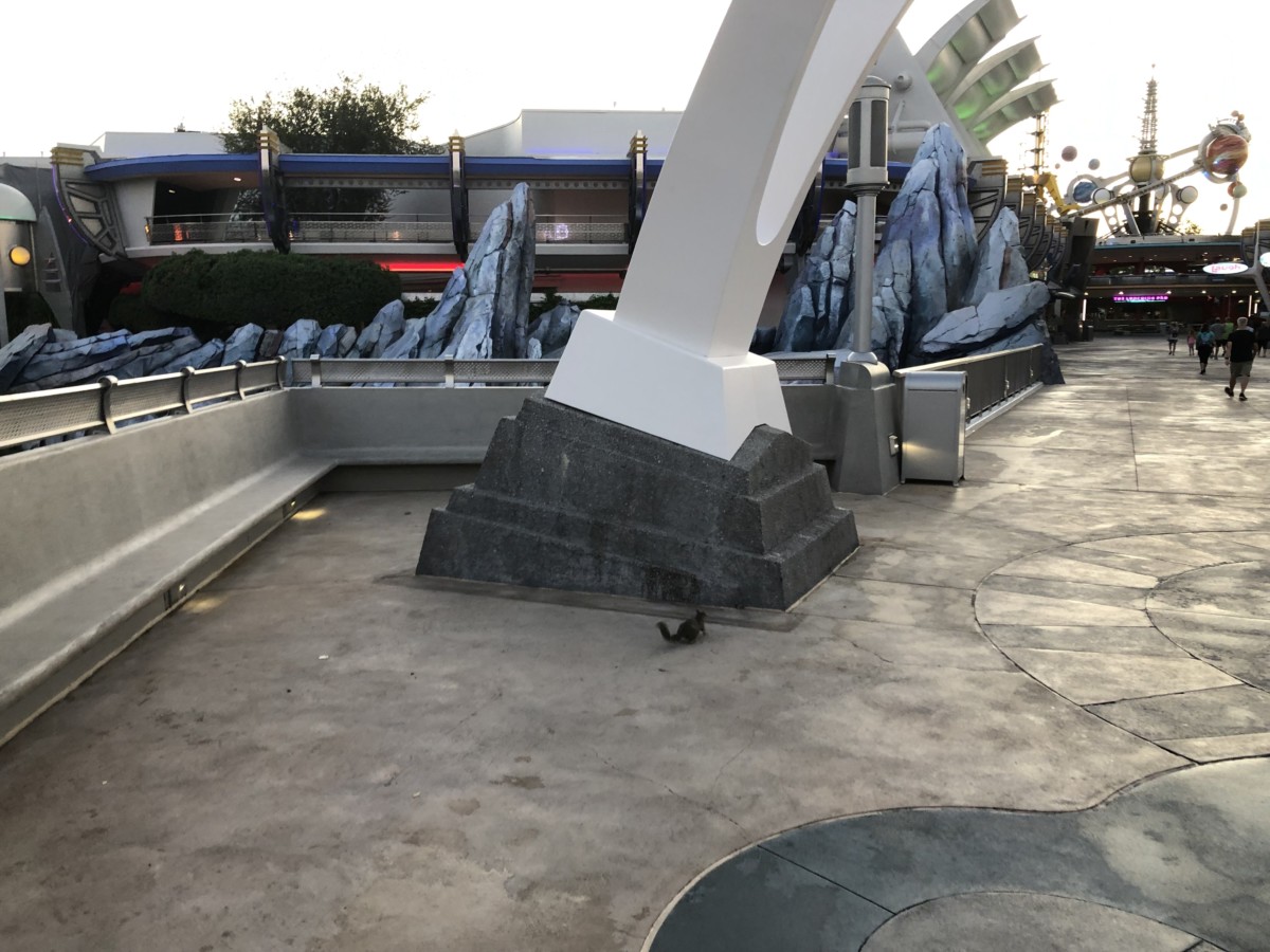
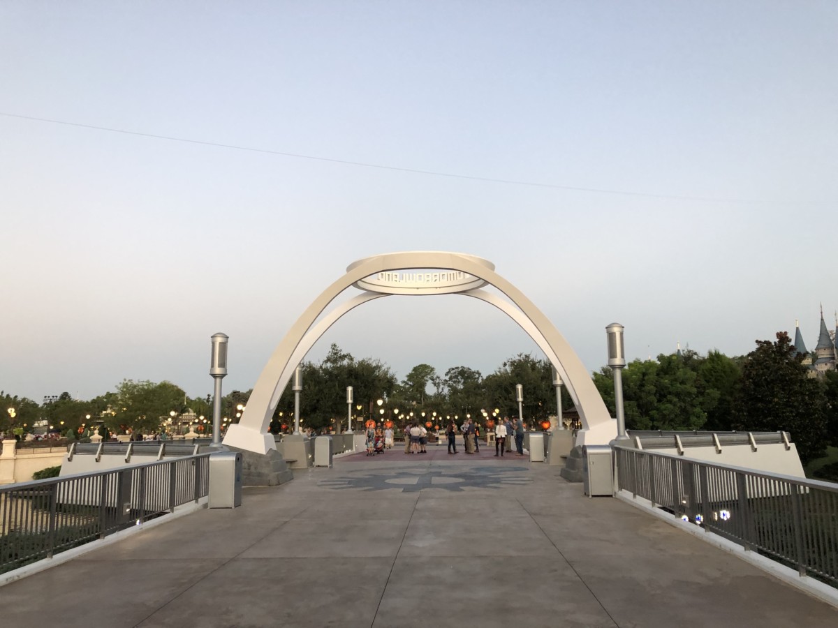
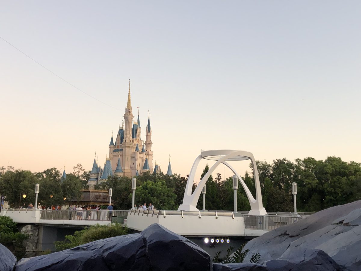

The sleek new Tomorrowland marquee has a very simple design, with bold lettering. Tomorrowland has needed an update for a while, but we’re not sure how we feel about this sign. What do you think of the new Tomorrowland sign?


She cute, kinda wish they combined this with the old school planets. It will complement Tron nicely though!!
It looks . . . incomplete, as if it’s missing a major decorative component. And the all-white “color” isn’t particularly inviting or exciting. I remain nonplussed for the time being.
I like the structure of the sign, but they typography misses the mark. It is out of scale for such a massive structure.
Seeing it in place, it feels very TRON. Which is ok, except…. Tomorrowland is more than Tron. I mean, heck, the coaster is not even there yet. Are the updates going to turn all of Tomorrowland into Tronland? If so, it’s an odd choice for such a cult franchise than most people haven’t seen.
Love it! It marks the beginning of the future Tomorrowland! With the new color scheme and Tron coaster I think it fits perfectly! This is modern, sleek and clean.. what most people think of the future! The old sign is what people thought of the future years ago! That’s my opinion but we will always have different ones!
Somewhat underwhelming
I have to disagree. I find it quite whelming.
Bring back the old design. Never change to new design because is not gonna give us a memory.
But my memories! I’ve already become so attached to this sign. My mother died 4 times from cancer this morning and she loved the new sign and wanted me to remember her and the sign and Disney can’t change it! Thanks Obama!
Honey you really need to stop licking the backs of the Pixar Pier stickers, it’s killing all your brain cells. Now come upstairs, I made your favorite little sammiches with the crust cut off.
I wouldn’t be surprised if this is the first in a long series of aesthetic updates in the lead-up to Tron. I think it makes sense to modernize the design a bit in subtle ways, especially with a huge new ride drawing more attention to that section of the park.
That’s a sharp looking sign…really does a nice job in establishing the theme of the land in a stylish manner. Well done!
Just like everything they have changed recently it’s more boring than what was there before
Welcome to your shitty minimalist future. Please pick up you 70s distopian jumpsuit on your way in and deposit all individualist items in the incinerator.
Bleh.
Boring boring boring. :-(
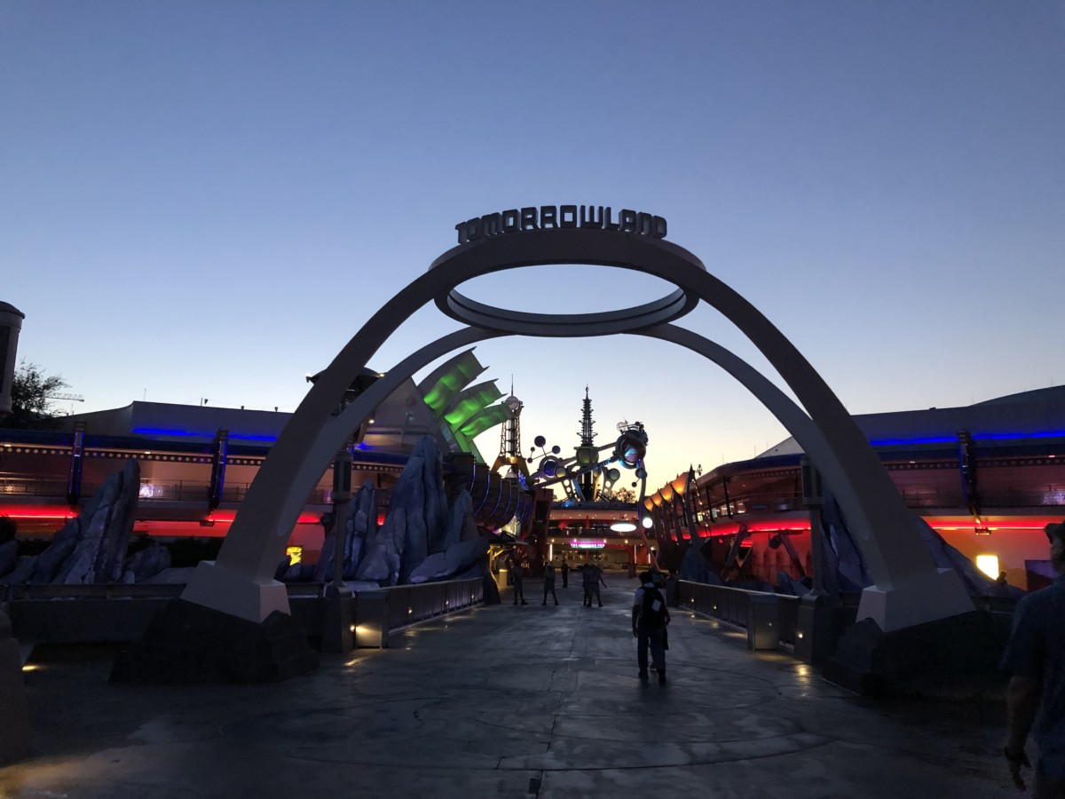
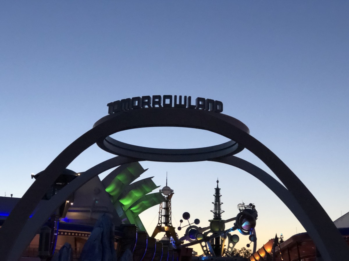
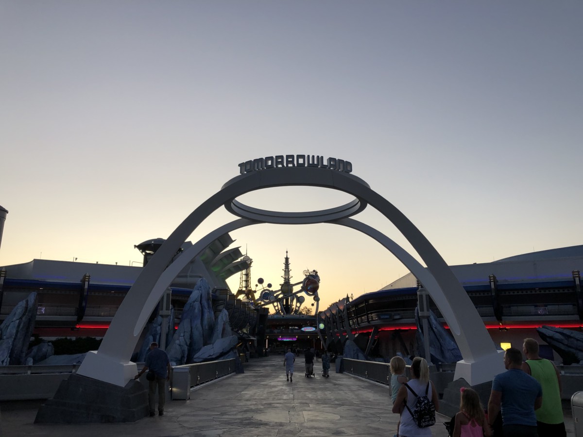
I’m curious to see what it looks like at night. I don’t mind the simple and sleek aesthetic and hope that all of Tomorrowland goes that direction.
It looks like it’s Not finished yet! Like something amazing & futuristic is going on top yet!
It looks unfinished. It’s too plain, not ‘Disney-fied’ enough. It looks like something amazing and futuristic should be put on top yet.
I love how the new Marquee Stands out at the Magic kingdom I think it looks really cool!
Hmmm….. I don’t care for it. Much too plain and the letters seem small – that seems to be a trend?
I really hope they aren’t finished with that. It’s boring, uninspiring, and lacks character. I hope they don’t make the whole land as bland as that sign.
Don’t love it or hate it. It IS cool looking and has a nice retro feel. But I’m not sure if retro is the right way to go with Tomorrowland. Be interesting to see how it looks at night.
I’m personally not a fan of the whole minimalist design fad, so I’m hoping there will be something else to go on the sign. The font is fine, but the sizing seems off? Like the letters are too small for the structure.
I like the design, but…..I find myself wanting to increase the font size. (Almost a Spinal Tap-esque Stonehenge kind of thing here.)
I liked the older sign better than the new one.
It seems unfinished. Reminds me of the “TOMORROWLAND” movie designs.
I think it’s beautiful. A perfect expression to align with the abstraction of the idea which is Tomorrowland. It’s not Tron at all- it more closely aligns to the idea and aesthetics of the carousel of progress or space mountain. The logo copy seems very inspired by the copy for the Trylon and Perisphere at the world of Tomorrow. Nice job Imagineers.
Does it light up at night?
Sparse is a word that comes to mind!
It’s hideous. Bring back the old sign. The old one had a much better aesthetic. This one is cheap looking and completely uninspired, like everything else Disney is doing to ruin the parks.
If this is a move to a more retro-futuristic design choice I’m excited. I’ve always hated the European overlays. They never have fit.
It looks like another lost opportunity to create some shade/rain protection. Bummer.
I like the new sign. Maybe there will be updates to the rest of Tomorrowland I hope? I could go steampunk route or go along with the movie. There is so much potential for this portion of the park as with some of the other lands.
I dig it! I hope they get some neon or other lighting up there soon, though!
I feel like the letters need to light up… I always love the way the old one lit up with a lot of colors
Much, much, better.
That previous sign with it’s hodge podge mess of ‘how the past saw the future’ was ridiculous.
Sleek minimalism will always be cool.
This is sad, just another way to take the magic of the old sign and replace it with something, dull, I guess. This doesn’t look like a great big beautiful tomorrow, it looks like there were budget cuts and they could make nothing like the original so they were like oh crap and hurried to make a new one, sad.
The sign is a total design botch. The shape is uninspired, the silhouette is bland and the lettering is an afterthought. F
Uninspired like all the rest of the shape language in pre ‘93 Tomorrowland? Uninspired like the works of Zaha Hadid and Santiago Calatrava? Uninspired like the masterpiece which is Space Mountain? It’s seems the shape language is based on the old marquee, and used the same foundations.
It’s cheap and unimpressive. I hope this isn’t it and Disney has plans fo make this better.
Love it. Confident and cool. Now let’s redesign all of Tomorrowland with this as the aesthetic touchstone.
It looks unfinished, and I agree with a previous poster, very boring. Part of the great memories that have always been made are from the detail of the whole “world”, not just the attractions. First trip we took my boys were amazed by everything they saw and actually wanted to take a photo by the Tomorrowland sign. The new marque is just not…. magical
Reminds me of the People mover track structure from Disneyland. Looks retro in that regard. Does not match with the Astro Orbiter the way that the old marquee did. Looks retro and out of place. Maybe it would fit in better at Disneyland in front of the People mover track structure.
Tomorrowland should be an escape into a fantastical imagined world of the future. A land where our imagination moves beyond the walls we have in our mind constrained by our everyday experiences. Where young minds are shown that the world can be much greater than the one you are in. I have trouble understanding how a white arch with white lettering expresses that. It’s almost the opposite of inspiring.
Tomorrowland is a place where the story is not written yet. I agree it’s where our mind moves beyond everyday experiences… but it starts with a blank slate. An un-storied moment- a palette cleanser in theme park design. That’s how a white arch with white lettering expresses that. I’d suggest Tomorrowland is the one land in the park where there is no back-story, and it’s all about challenging your sense of what’s possible and who you could be tomorrow.
What was the date the new sign went up? I was there last week and didn’t see it.
The date this article was published. Sept 17.
I hope Disney didn’t spend too many hours designing that. Talk about underwhelming. “Hey guys, let’s take this really cool thing and replace it with this really dull thing!”
The new sign is quite plain and the old sign was super busy. I wish we could have something in-between the two. However, i do love the sleek vibes.
LOOKS GREAT BUT COULD DO WITH SOME NEON LIGHTS OR LED LIGHTING SOMETHING THAT COULD MAKE IT STAND OUT IN THE NIGHT TIME