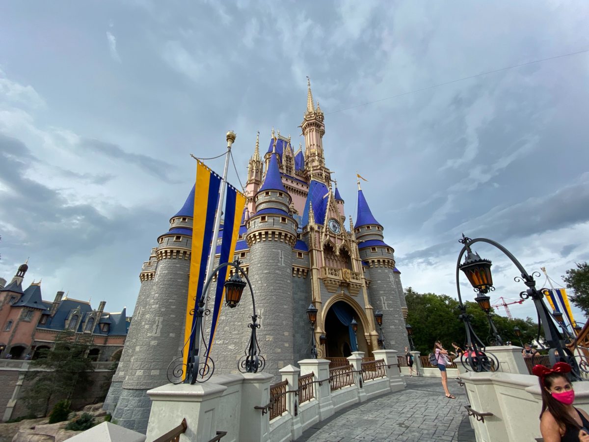
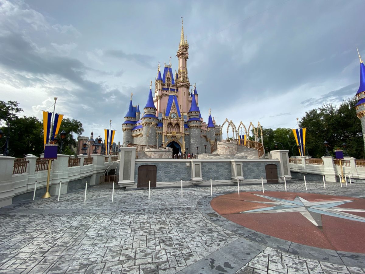
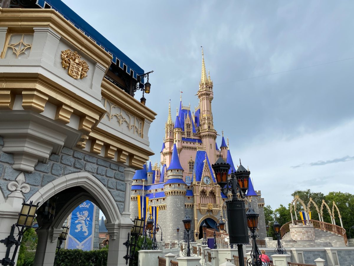
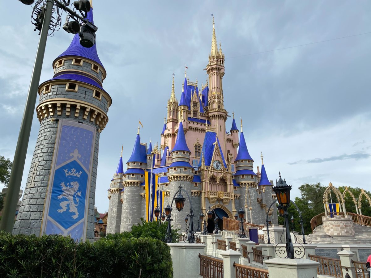
Welcome home! Magic Kingdom began cast member previews today, and the new paintwork on Cinderella Castle is nothing short of breathtaking. After our first look this morning, we were able to admire its beauty up close.
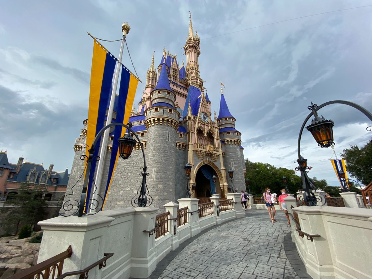
Here’s a look at the front of the castle as seen from the Magic Kingdom hub.
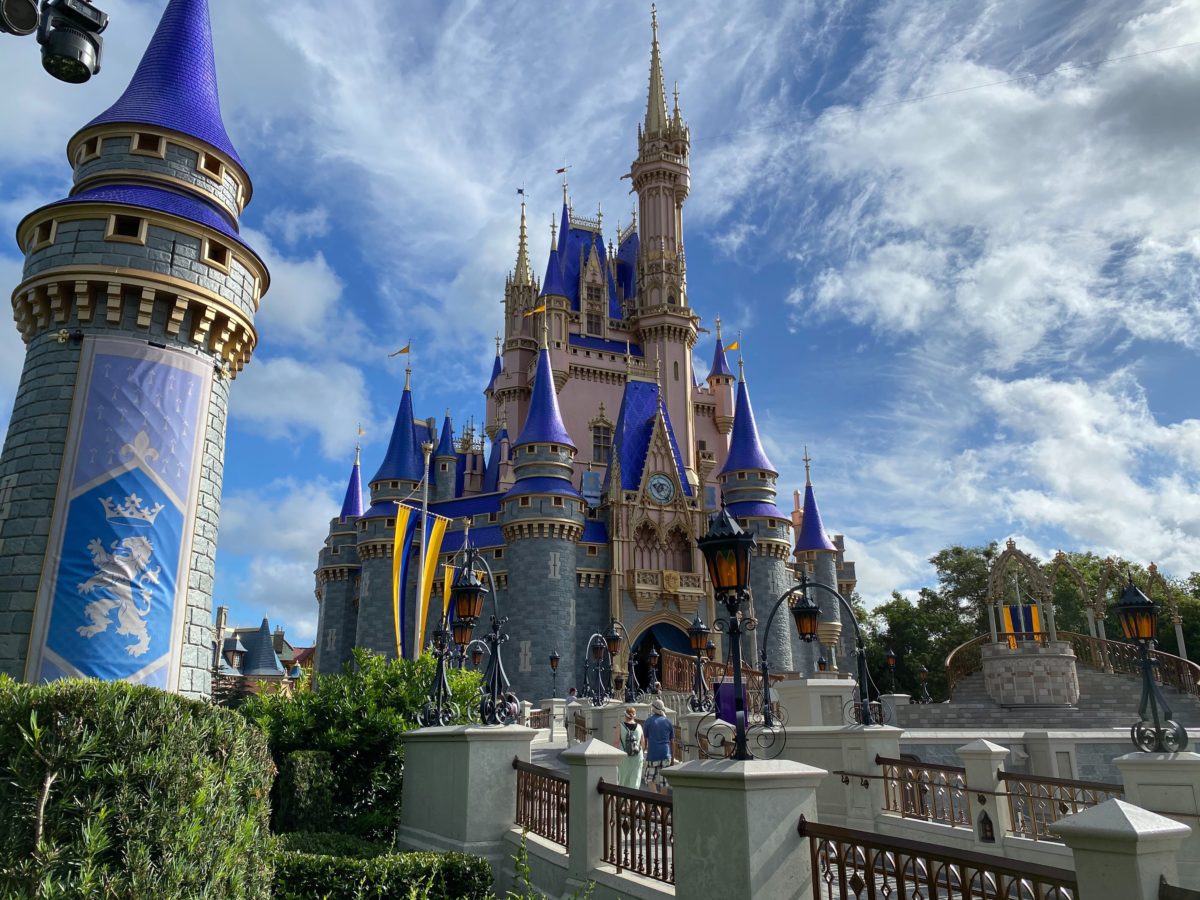
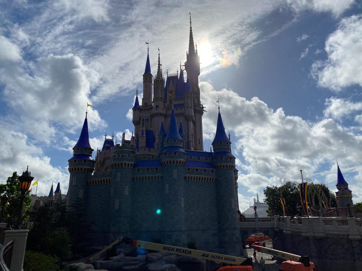
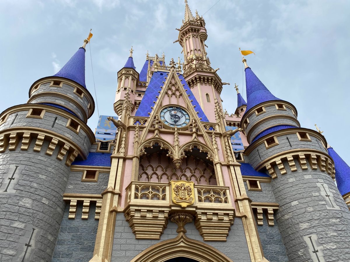
The gold detailing on Cinderella Castle is stunning up close.
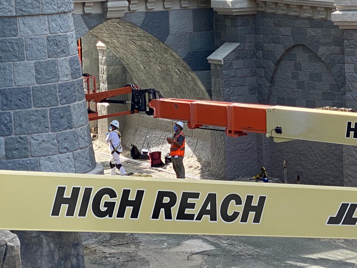
Oh, how we’ve missed these magical mosaic murals.
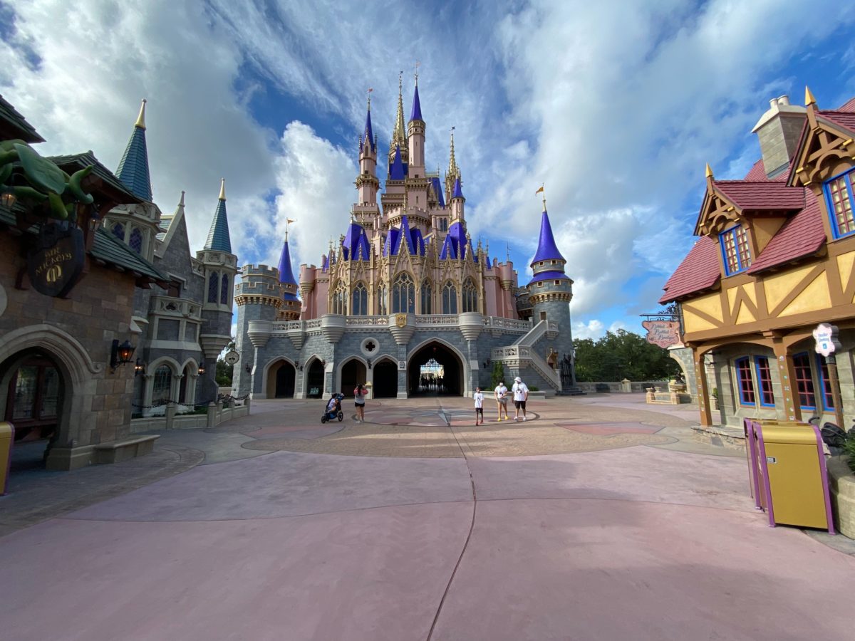
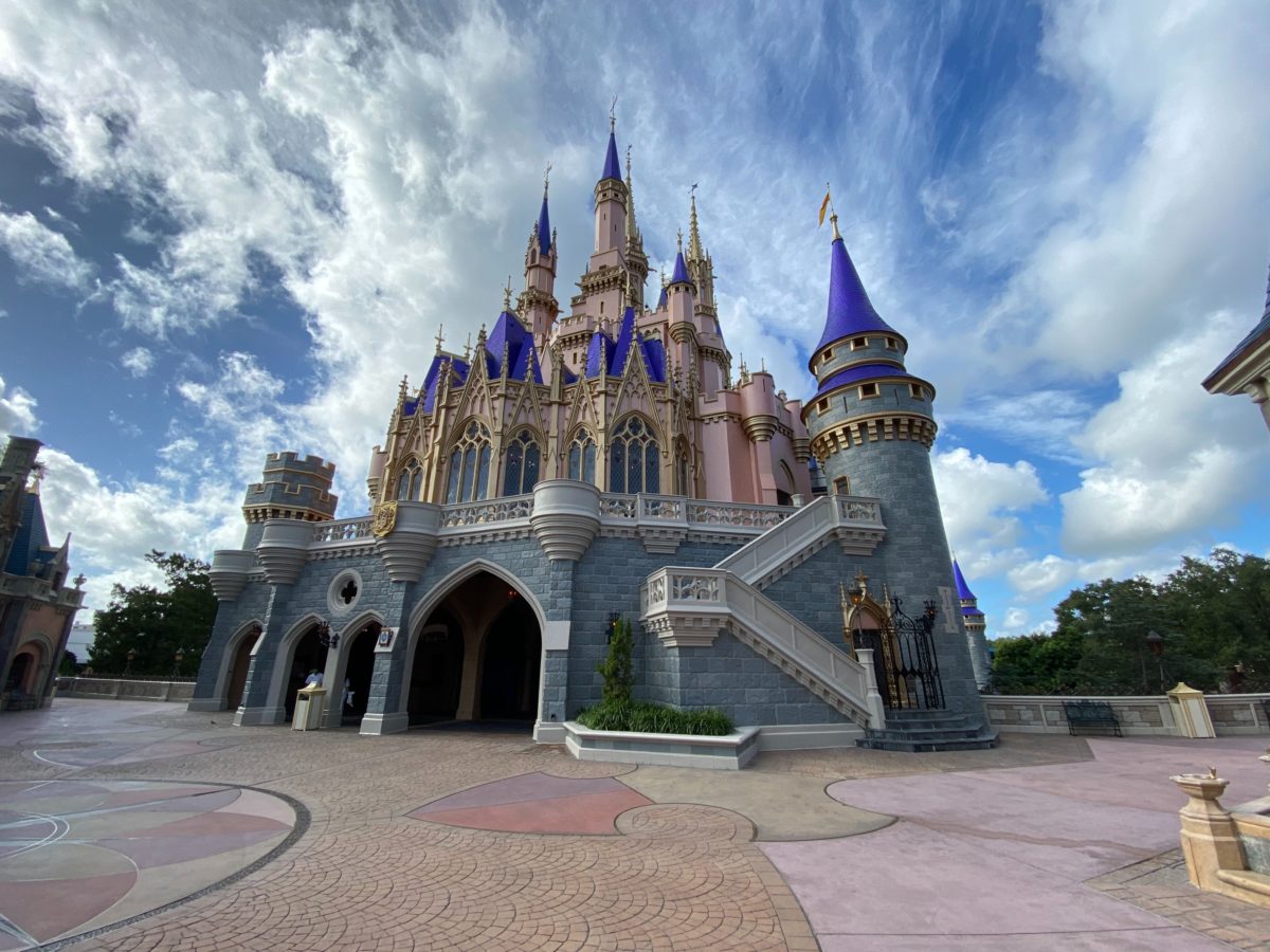
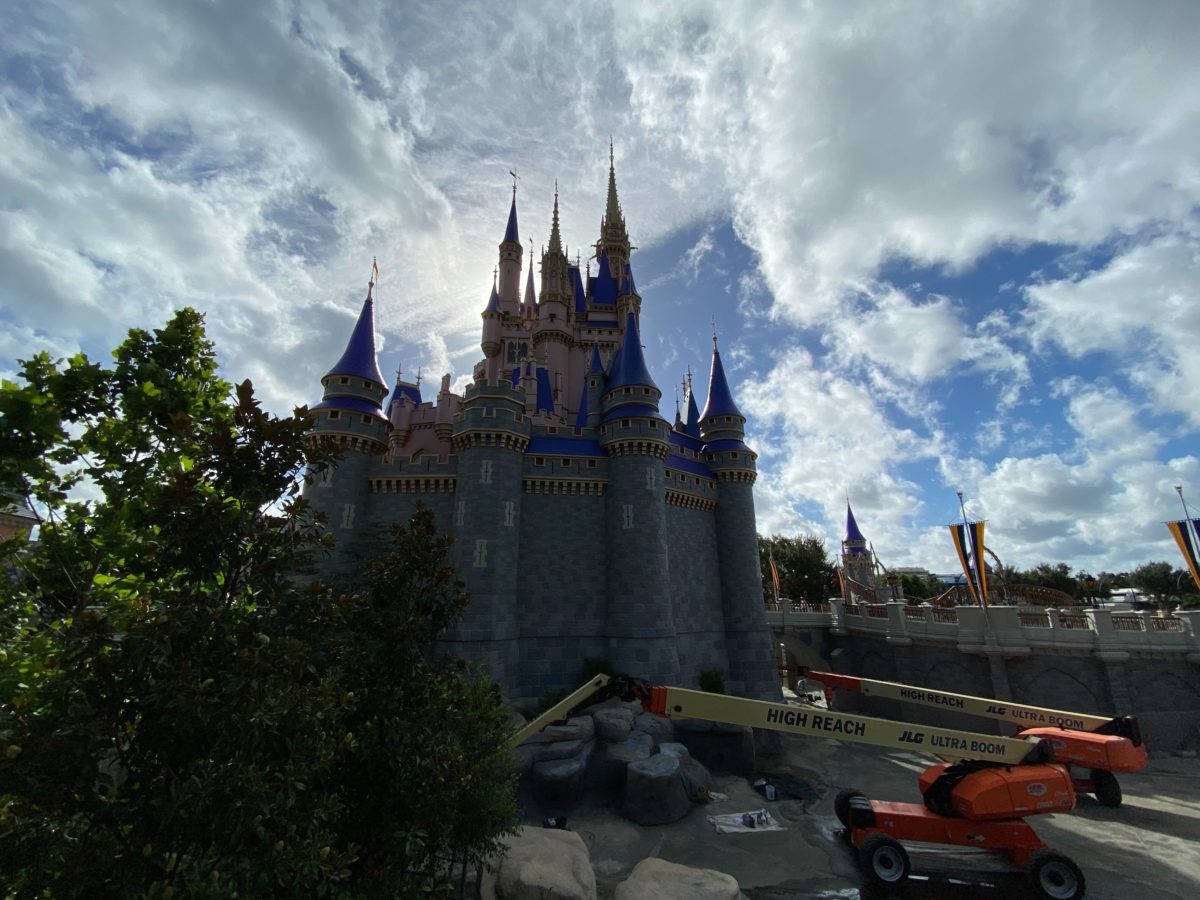
We didn’t know it was possible, but Cinderella Castle at the Magic Kingdom looks more magical than ever before.
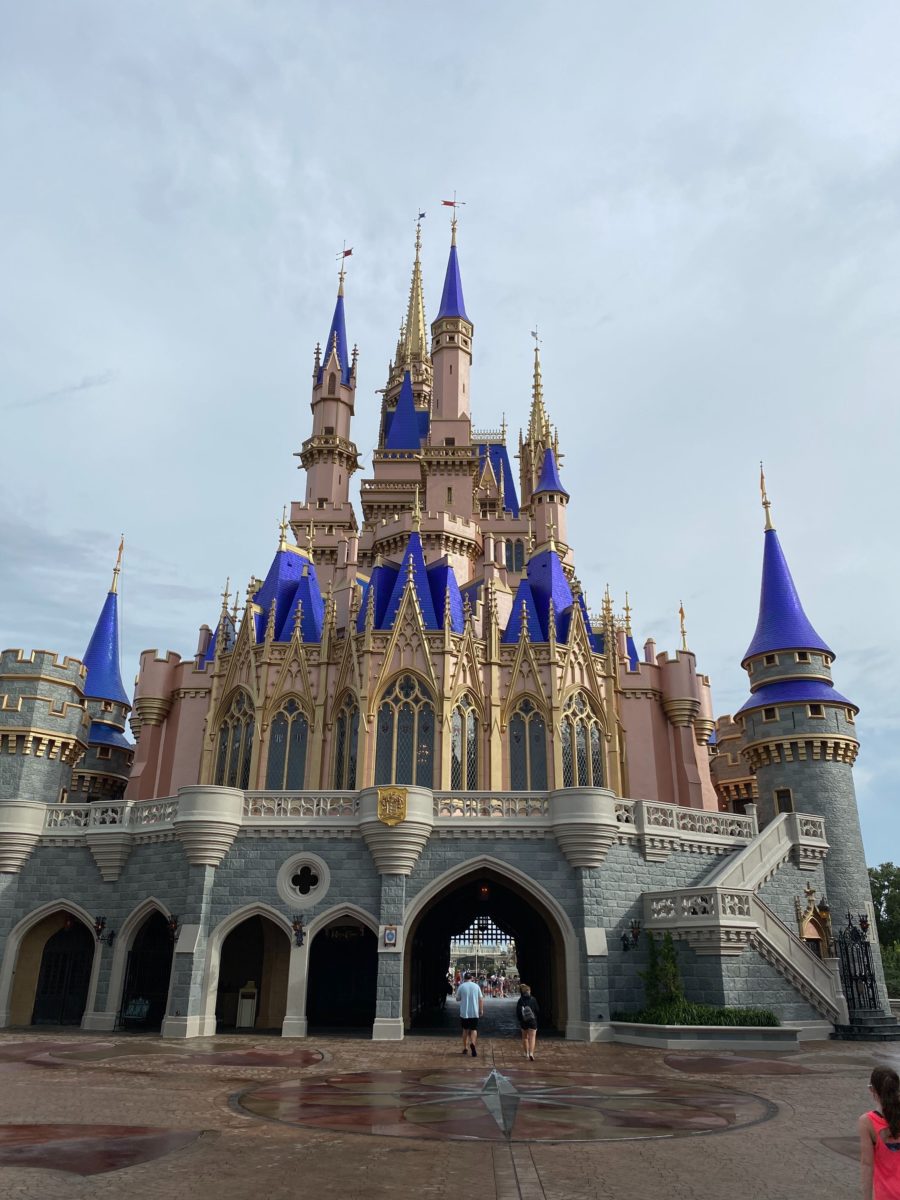
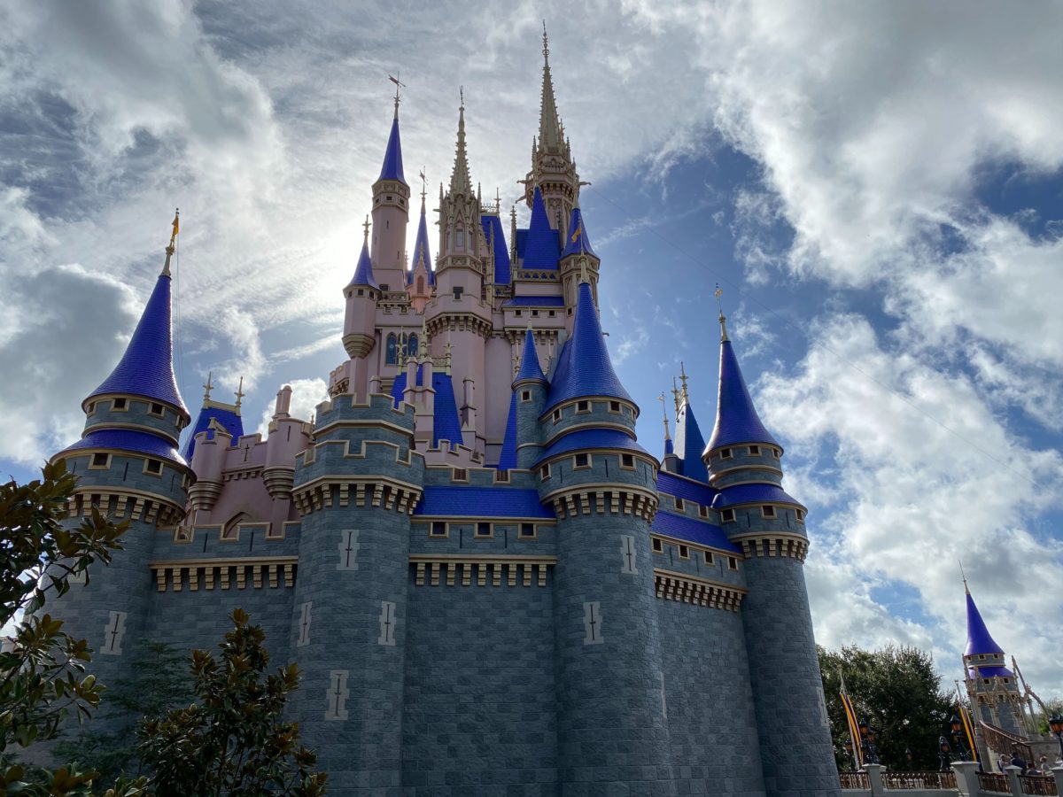
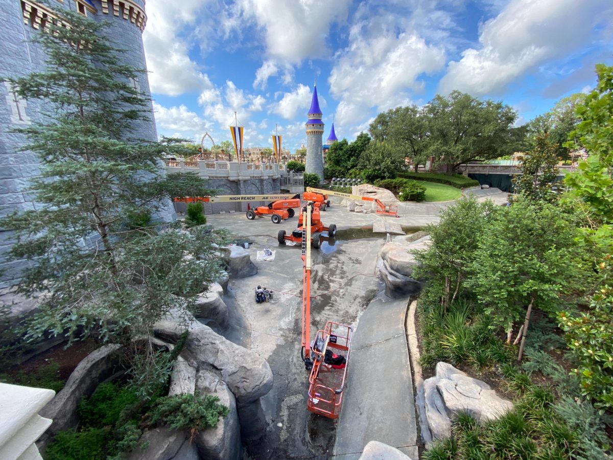
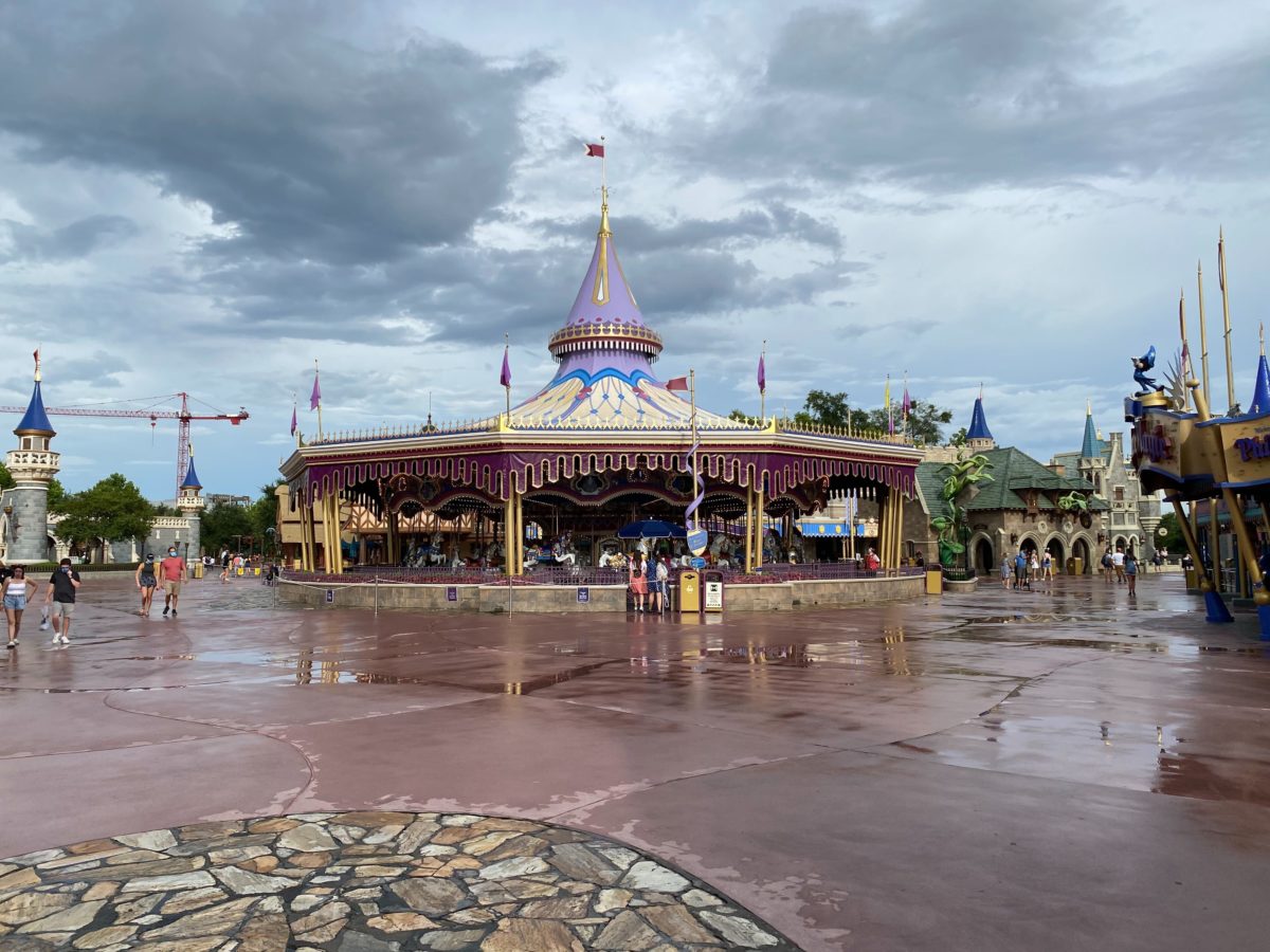
Crowd levels remained low throughout the day yesterday for Cast Member previews, as you can tell from this view of Fantasyland. The towers of the surrounding castle walls throughout Fantasyland area also being painted to match.
Finishing touches on the castle are set to be completed by the end of summer. Stay tuned for the latest news regarding Disney parks reopening previews as well as official public reopenings later this week.


As hideous and cheap as my ex.
The castle looks great, mostly. The deep blue is beautiful, the pink in pretty, the gold is always nice; but the gray is abit too dark, maybe light gray or a nice beige.
Breathtaking? Is it, though? I think the blue looks plastic and the pink looks sickly and dingy. The only good part is the gold and it’s washed out by the salmon/Pepto bismol.
I’m holding my breath for what else the imagineers and upper management will ruin because they’re on quite a roll these days.
It doesn’t look bad, but I preferred the old scheme. Perhaps Deep Blue and a greige would’ve been better. I feel like they’re trying to copy Paris’ castle
They did a great job matching the Paint Scheme to Sleeping Beauty Castle in California!