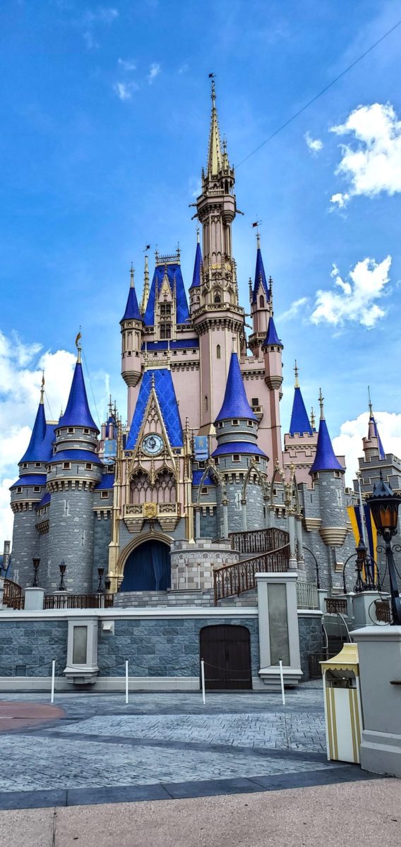
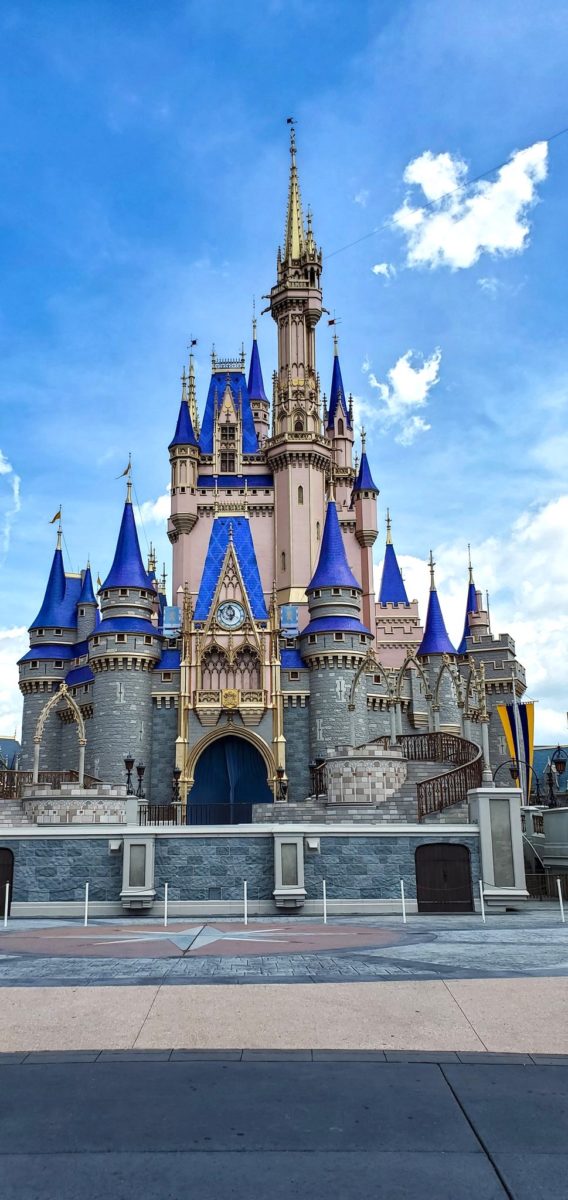
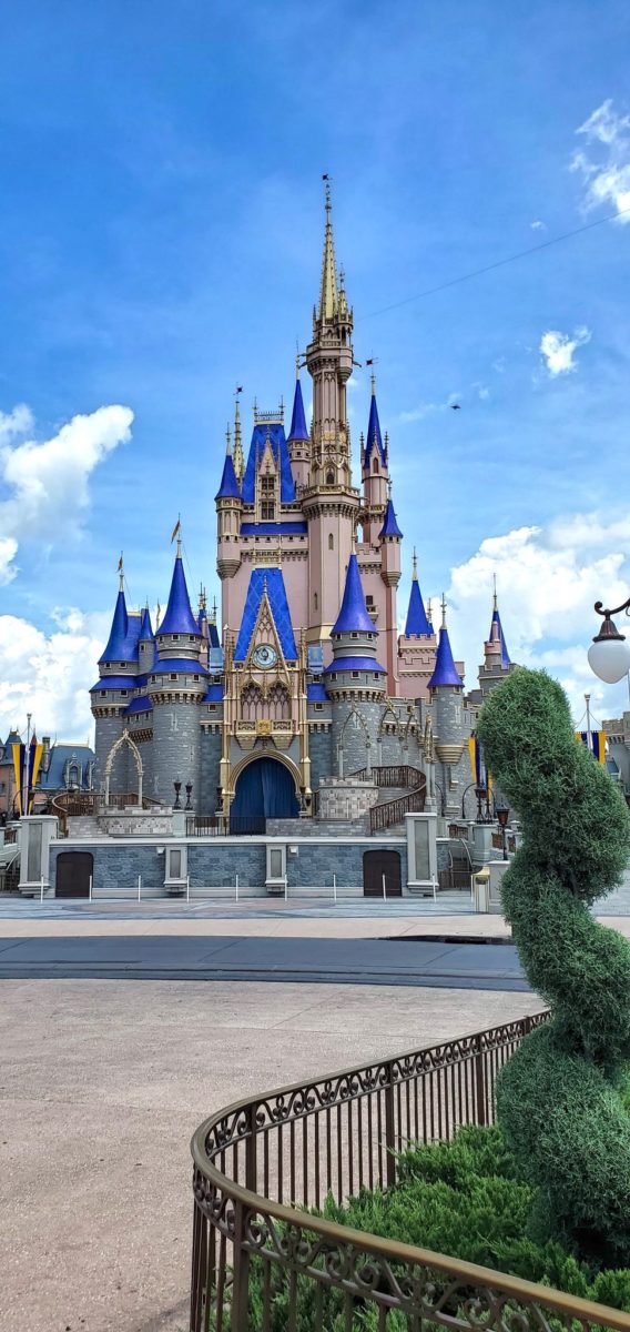
Tomorrow, Cast Members and their guests will be among the first to re-enter the Magic Kingdom as it reopens for its first day of previews. With that will come a first look at the completed Cinderella Castle, which began its magical makeover just a few months before the historic, unprecedented closure. Today, we have a special first look at the completed Cinderella Castle—not from afar, but from the very grounds of the hub:

The dark, royal blue turrets are now topped with freshly-gilded gold spires. Along the center body of the castle is a faint, rose gold color—much lighter and subdued in these photos than the castle has appeared in previous aerial photos.


While off to the sides of the frame of the photo, the surrounding towers that bookend the castle stage have also received a coat of royal blue paint.
What do you think of the new look for Cinderella Castle? Will you be spending some time at the Magic Kingdom hub taking in the castle’s new look? Let us know in the comments!


Very pretty!
I’m SO happy the pink is lighter than what is showing as earlier. I think it looks great!
Makes me sad. That blue is too heavy and the sick pink drags it down.
Sorry, but I am not a fan of this new look
Have/will the moats be refilled soon? Looks amazing!!
The pink definitely looks lighter in these pics than the aerial footage suggested. I was getting worried after some of the aerial pics. Still like the old castle better but this is better than it looked like it was heading.
I know it’s just a picture and it probably doesn’t do it justice but if the picture is any indication, I love it!
I was hoping for a bit more gold a-la the happiest celebration makeover, but the pink is not as bad as I thought it would be!
Where will Kappernick sleep?
Cinderella’s Castle looks too new and too much in the foreground with the revised scheme. I think a castle should look old and far away because we don’t walk down the street and see a brand new castle. A more pastel look would suggest that the castle is rising out of the viewers imagination.
It should have been a dark muted blue, this is too vibrant Doesn’t look anything like the redention picture. The pink looks great the gold too even if is pale but I understand to achieve the gold tone you need gold leaf and that takes months to apply it. Judging by this they might change it back later on.
Its basically a stage now anyway. Paint away..I miss the days you could walk through that was special. Sigh
Yuk
This looks beautiful, and so much more tasteful than the monstrosity that we had the misfortune of being surprised with when we happened to visit during the 25th Anniversary, back in ‘97 LOL… Just google pictures of that, and prepare to be relieved with their current choice.
Save Splash Mountain!
I am a big fan of that vibrant blue and the gold accents, but the pink just doesn’t seem right…
I wish the gold was more prevalent and that the old color scheme for the body was still there.
Pretty but looks more like Aurora with that blue and pink…Cinderella’s castle is not that color…
How incredibly ugly. When I went to Disneyland as a child, many years ago – and before any remodeling was done – the castle was the stunning centerpiece. Later, when I made it to Walt Disney world, it too, had a beautiful, bright castle. It’s important to note that Sleeping Beauty’s Castle, and later, Cinderella’s Castle, were modeled after Neuschwanstein Castle in Bavaria – a beautiful, white limestone masterpiece that all but glistens in the sun. In both films, the castles are bright and magical. This, in contrast, is dark, dreary, and gloomy – more like the inside of a medieval dungeon. The one at Disneyland is worse. Did the “Imagineers” lose their imagination? Did they even watch Walt Disney’s Cinderella? Or did some fool from marketing make these horrific (and depressing) design decisions? If Walt could see this, I think he would be terribly disappointed.
Hideous, & childhood memory ruining, won’t be spending my money returning or buying new merch. I’ve retyped this 3 times now cause I’m so disappointed, sad, and angry. Moms who spent our lives working to get to take our kids to Disney and buy official merchandise from our once in a lifetime trip and this is the thanks we get: Disney repaints the iconic Cinderella Castle to look like this – a cheap, ripoff merch version that we’ve seen sold in bootleg shops for the same amount of time :( What was wrong with the classic look? THAT actually looked elegant & royal and was beautiful. Not everything classic needs to be reimagined into something different.
🤮