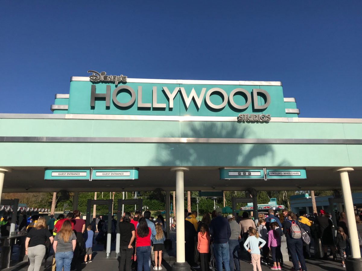
In just a few days, Disney’s Hollywood Studios will be flooded with guests looking to ride the park’s newest attraction, Star Wars: Rise of the Resistance. The park has seen a number of improvements over the year in anticipation for the opening of its new Star Wars: Galaxy’s Edge land, including a brand new entrance plaza, the addition of a Disney Skyliner station, plus a revamped security screening area. New to the security screening area is a marquee sign featuring the park’s latest logo:
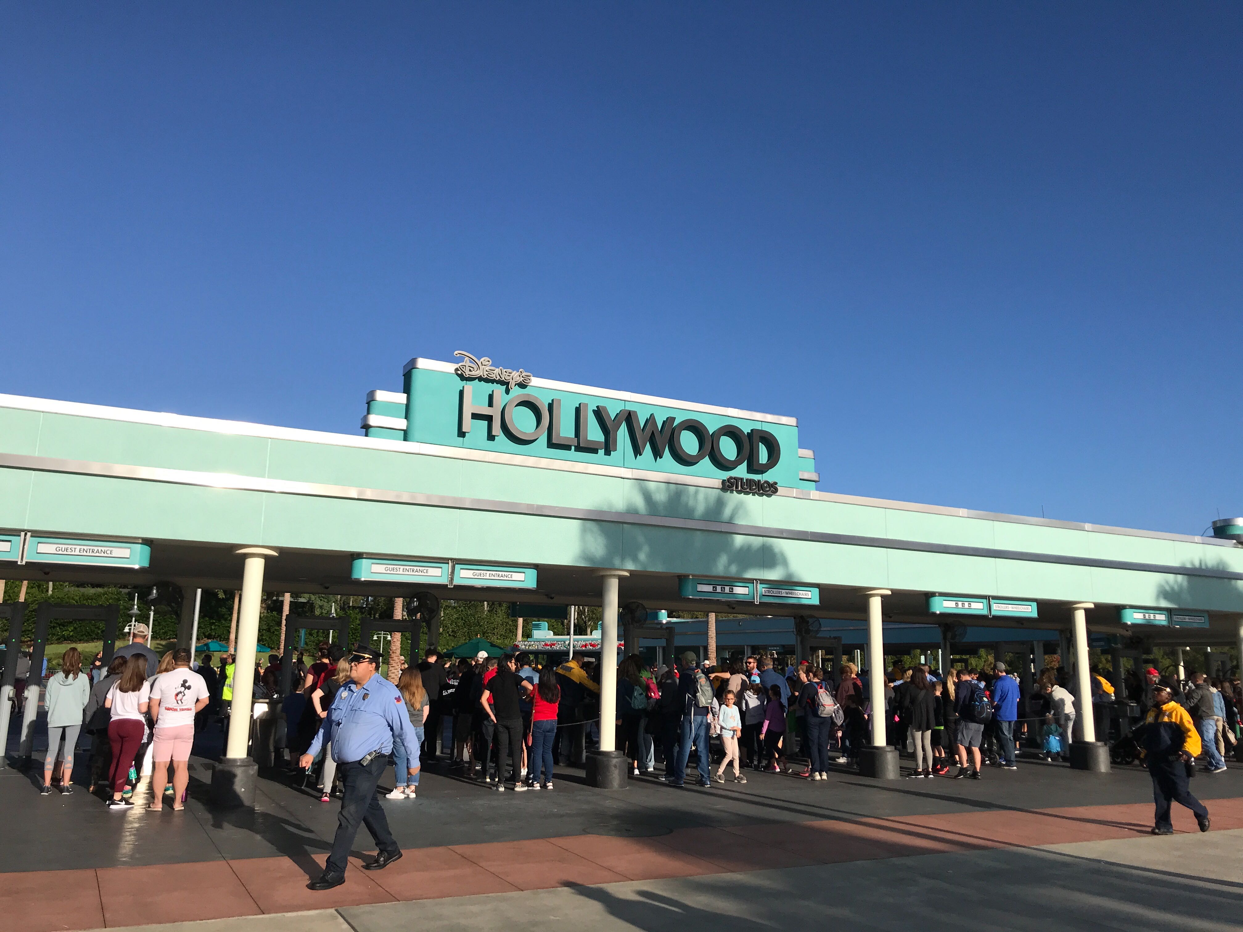
The sign was added in over the top of the security screening area, giving it some needed flair. Despite teal and silver accents, the area was rather bare and desperately needed some additional signage.

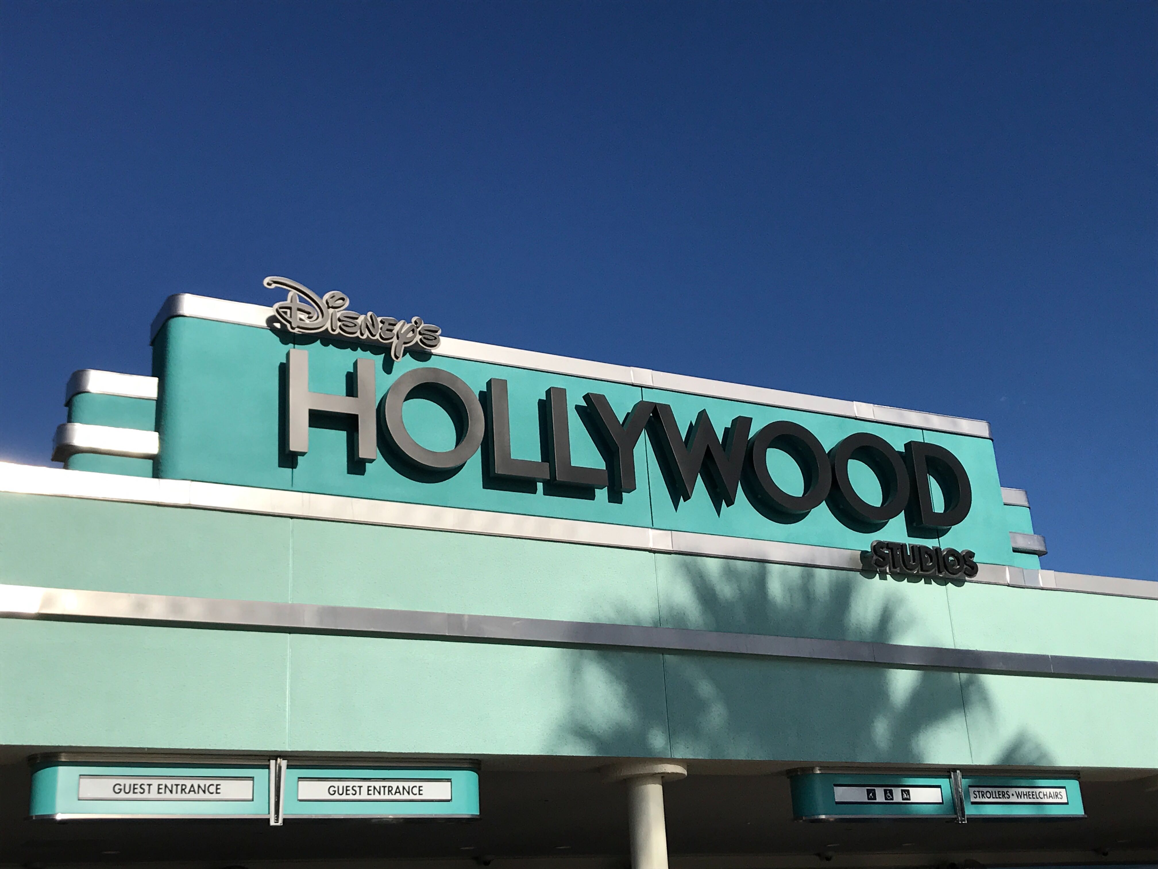
The marquee sign is painted in a darker, stronger shade of teal with the new Disney’s Hollywood Studios logo prominently featured. We also saw this logo grace the iconic Animation Courtyard arches recently.
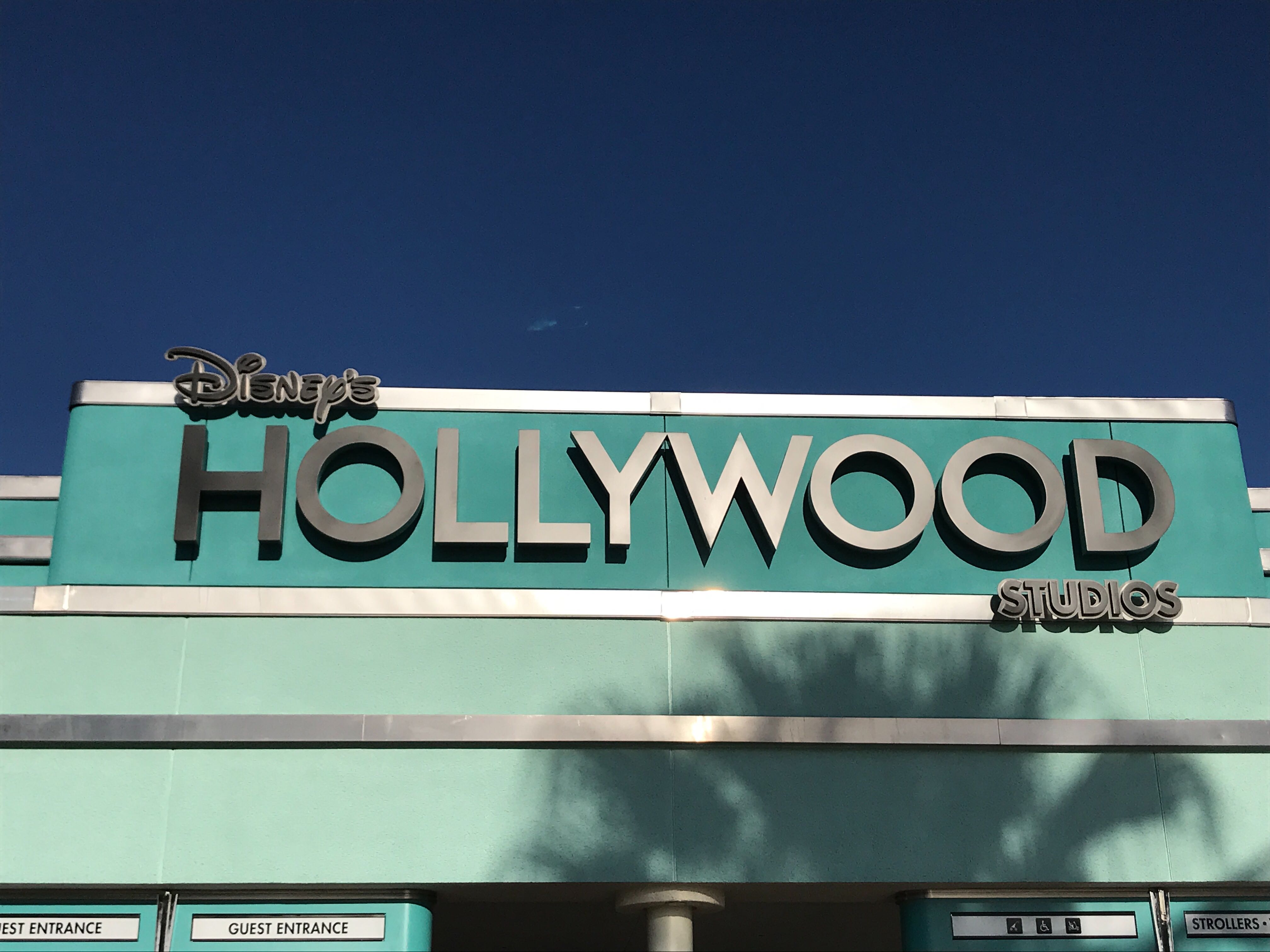
Much like the Animation Courtyard sign, this logo is notably void of the characters used in some versions of the new logo. It appears they’re sticking to the simplest version of the logo to keep with the overall Art Deco style of the park.
What do you think of the new sign? Are you looking forward to seeing all of the added touches to the park as we near the opening of Rise of the Resistance?


Thank God they have refrained from using the characters in the logo! I like the look of the art deco font as is. To be honest, this is the most restrained I think ol’ Chapek has been during this “IP Era.”
This sign is bland and boring. It could really use some creativity.
Looks sleek. I like it.
lol someone downvoted me because I shared a harmless opinion…pathetic.